stacked bar charts of my work hours
[gnuplot markdown Perl Vim keeping logs of my hours, quick and easy
Back in 2014 I decided to track how I was using my time, so I began logging my hours using my newly acquired skills (vim and related tools). Currently all of my hours are logged in a markdown file roles.md, which is now huge, but Vim handles it easily, and with my vim configurations, it’s contents look like this:
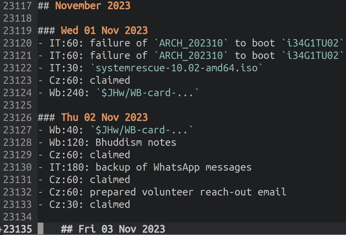
I coded my work categories, so, for example, Cz:60 means 60 minutes of work done for Cafézoïde.
then visualising my hours
For years I thought I’d need to learn R to be able to display my hours logs as stacked bar charts. Then I realised I could do it with pgfplots, and, as I got started reading how to do so, I discovered gnuplot, and went with that instead. I needed a few days to sufficiently understand gnuplot and to adapt my toolchain, but it feels worth the effort - misc/CP/workHours/ - which gets me pages like this:
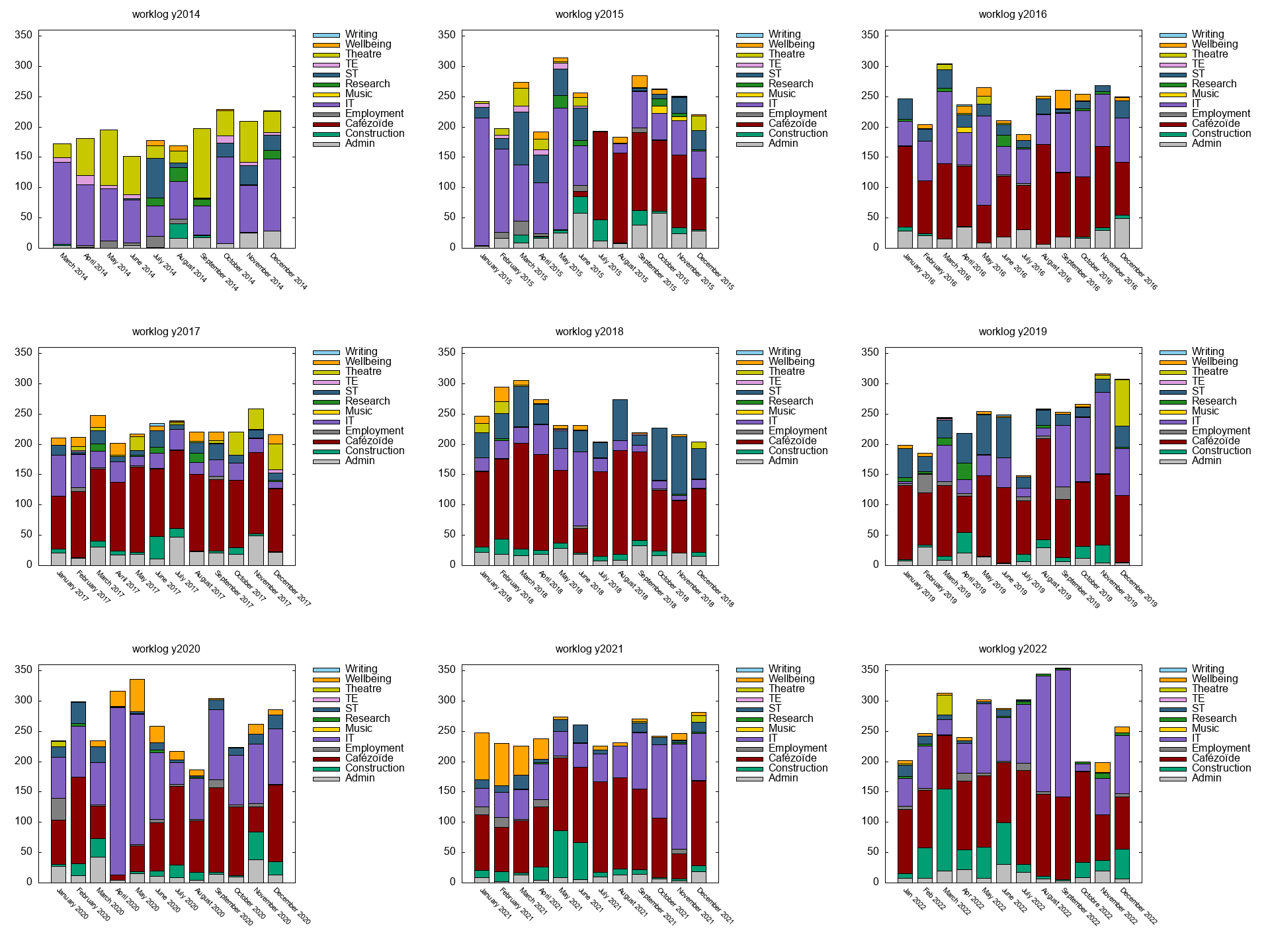 - at last I can see where my time went this past decade…